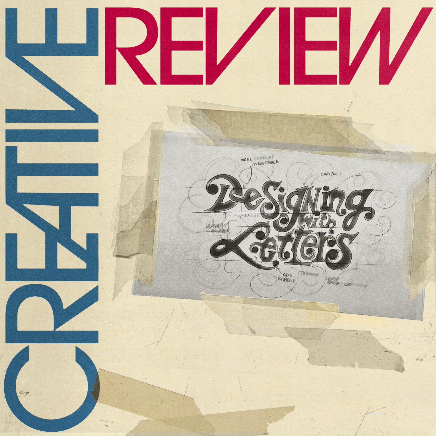
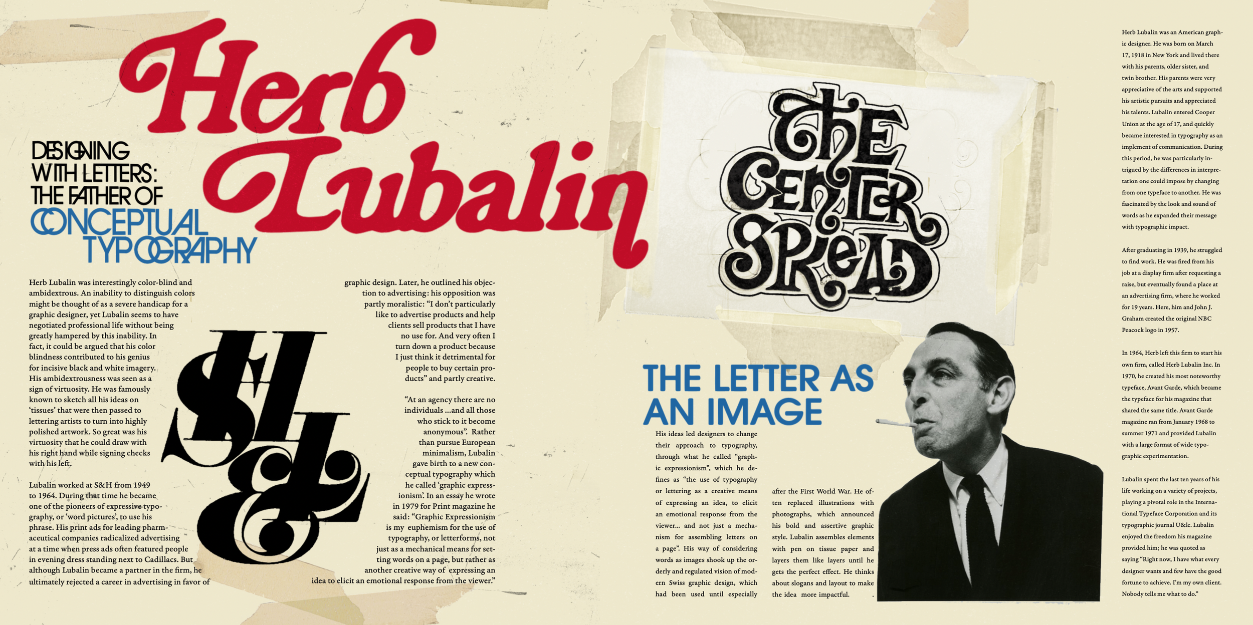
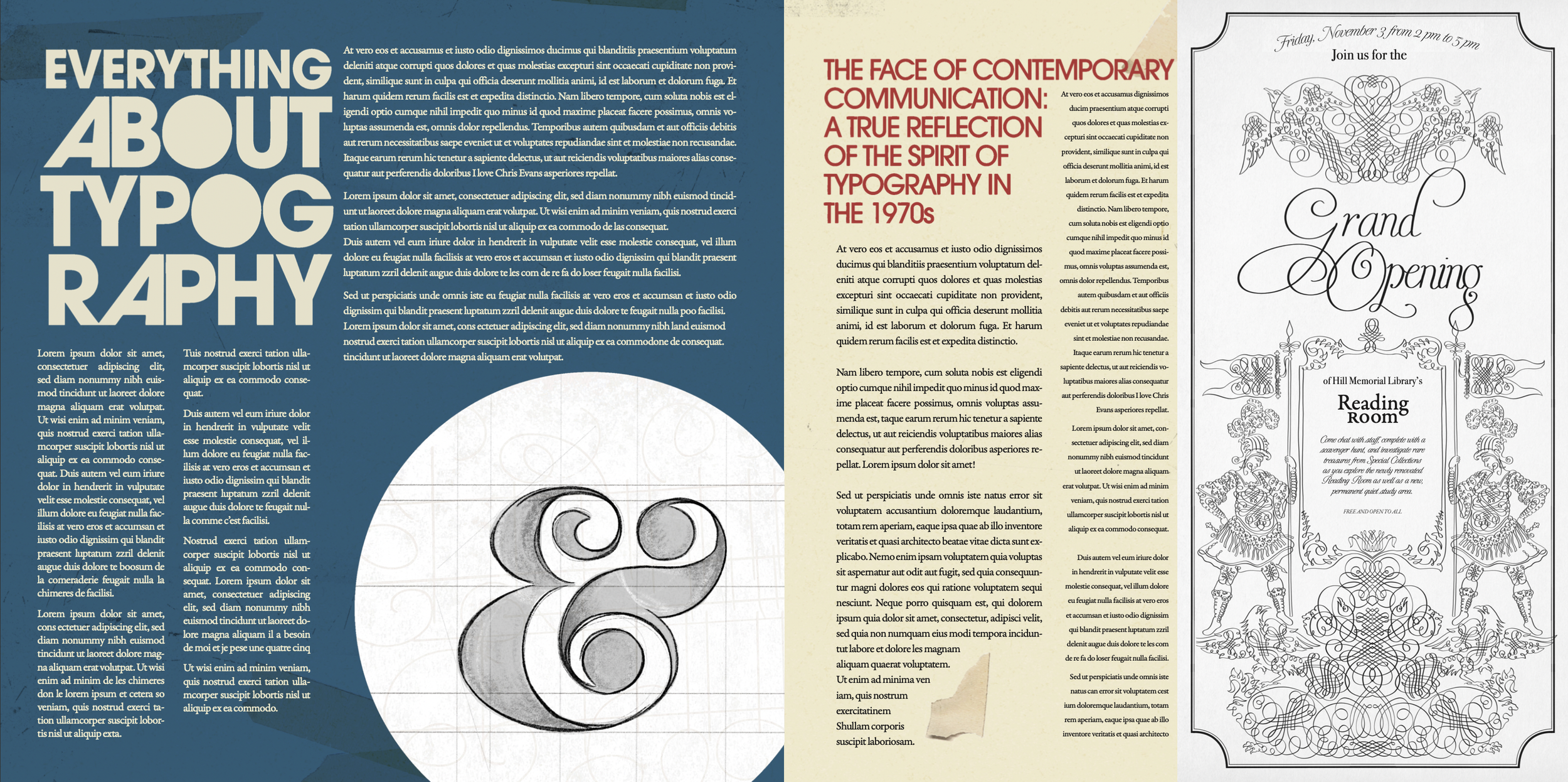
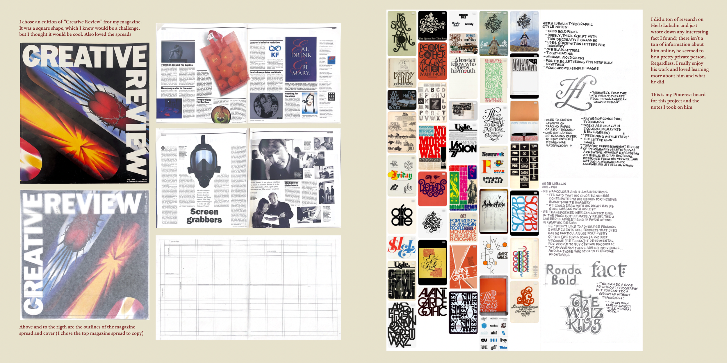
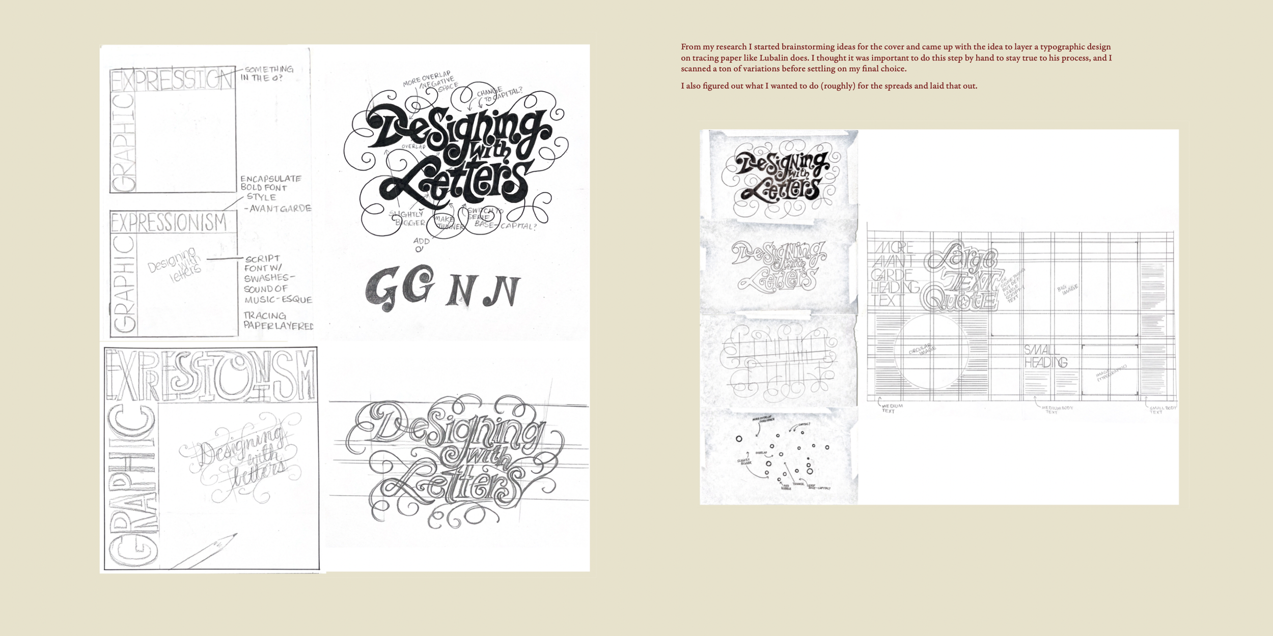
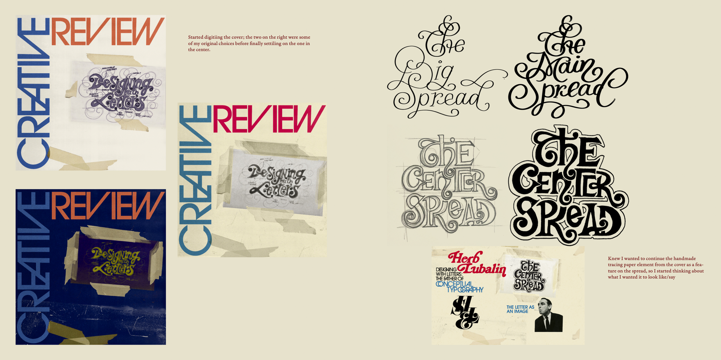
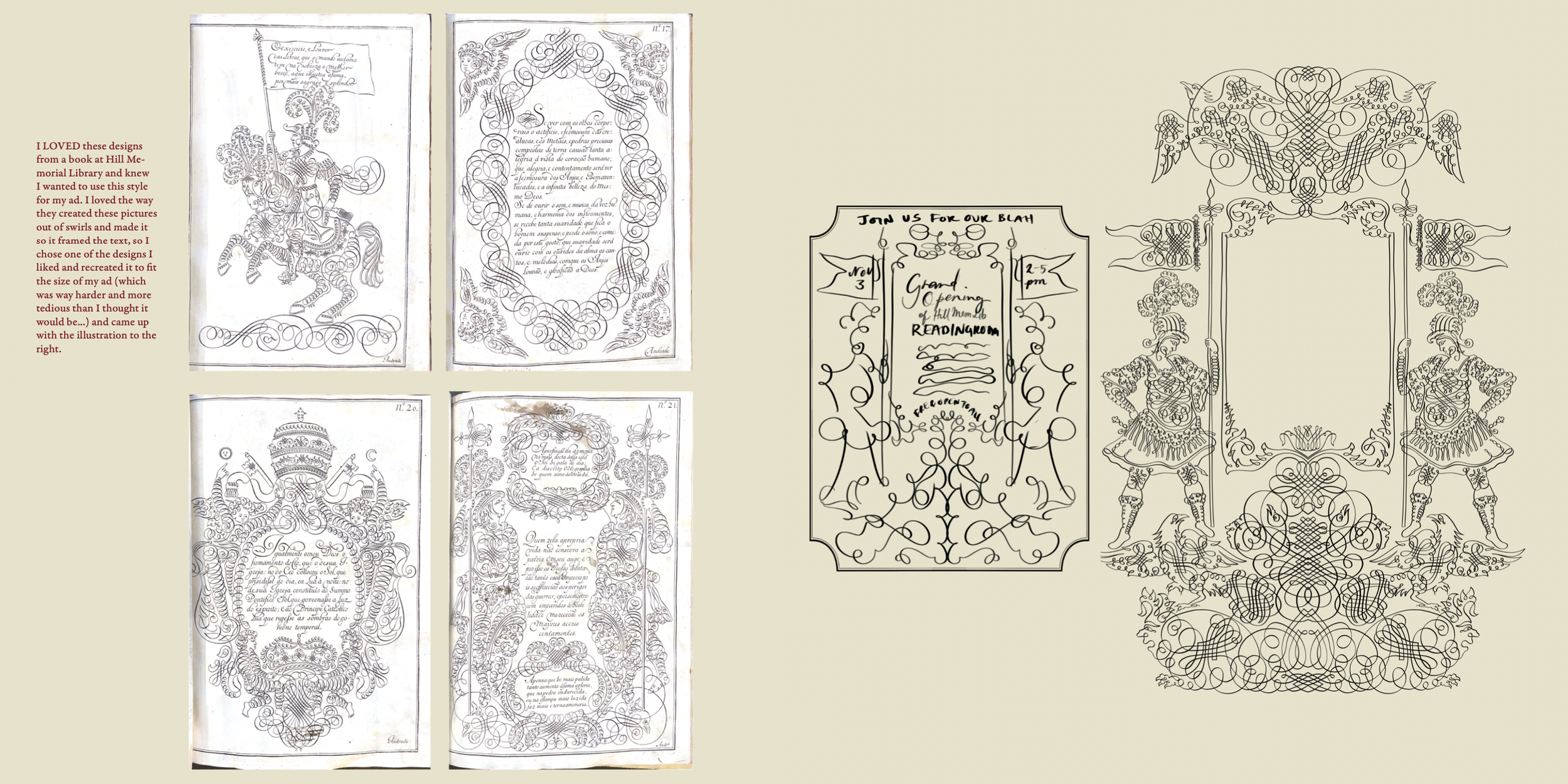
A reimagined editorial layout inspired by the expressive typography of Herb Lubalin. I deconstructed a magazine spread, rebuilt its grid system, and infused it with Lubalin’s signature visual language — bold type, tight ligatures, and graphic clarity. Paired with a custom ad drawn from archival research, this piece explores how structure and personality collide on the page.
